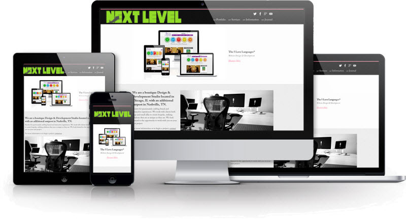
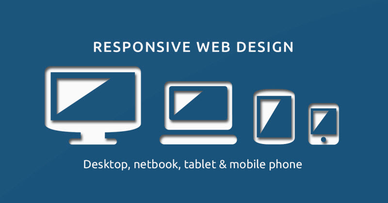
There’s more than one way to build a website, we use Responsive Designs to build ours. So what are the benefits of Responsive Design for your business? It’s all about building your site once and building it right, delivering the best possible experience to every visitor.
The best user experience on every device
These days people are as likely to reach for their smartphone or tablet as they are to use their desktop or notebook when searching the internet, according to Google Insights research. What that indicates is that your business needs an effective web presence on all devices, or else you risk becoming invisible to a growing number of potential customers.
The primary goal of Responsive Design is to focus on the end user and produce the best experience on every device. It lets you tailor the user experience for mobile visitors without asking them to sacrifice features and usability, therefore, offering the best of both worlds. Your website can adapt quickly for all of today’s gadgets as well as tomorrow’s, offering a level of proofing for the future which helps improve your Return on Investment.
Consistency of experience
Also found by Google’s research is that people have a tendency to move between devices throughout their interaction with your business rather than sticking with the one device. They might initially use their smartphone to browse online, then, when they are ready to make a purchase, come back on their desktop or notebook.
You don’t want to lose potential customers at any point. Offering a consistent user experience with identical information architecture across all these devices makes it easier for visitors to pick up where they left off when switching between devices, which increases the chances of them becoming paying customers.
Single code base
It seems there’s an app for everything these days. It may be tempting to want to follow along. However, building and maintaining apps for the various mobile platforms is a daunting commitment and still might not help you achieve your goals.
You can no longer focus on Apple’s standardized iOS platform for iPhones alone if you’re aiming to reach as many potential customers as possible. Google’s Android smartphone platform has surpassed Apple’s market share, but it is a fragmented ecosystem which presents many challenges for app developers. Android owners have many choices when it comes to screen size, resolution, grunt under the bonnet and other features. That is a boon for end users but a burden for developers.
If you add Windows Phone 8 and BlackBerry to the list, you’ve now got four separate mobile apps to build and maintain, despite that they all serve basically the same purpose. This is where Responsive Design is brought into use, because your website can be optimized for all devices while relying on a single code base.
With Responsive Design, your single website can also adapt on the fly for any screen size thus eliminating the need to maintain separate desktop and mobile websites. Again, this allows you to focus all your efforts on a single code base, knowing you’re offering the best user experience for every visitor.
Single content management
Websites are backed by Content Management Systems which serve up information and images as required. Sticking with a single code base also lets you stick with a single back-end Content Management System.
Relying on a single Content Management System, designed to support any device, means you only need to enter content once. The CMS will do the rest, automatically optimizing it for every device. The ability to adapt on the fly to best suit a device’s capabilities means you’re well-placed to support new devices as they hit the shelves without the need to start from scratch each time. This ensures that you’re always offering the best user experience on the latest devices.
Best practice for Search Engine Optimization
Any content you lock away in an app isn’t exposed to the web and won’t show up in Google search results. Without a strong Google search ranking, you’re pretty much invisible in the internet age.
Most people will not go to the trouble of downloading an app just to learn the basics of what your business does – those details need to be readily available online. Fragmenting your web presence between desktop and mobile websites can also fragment your all-important Search Engine Optimization efforts designed to drive potential customers to your website. Responsive Design lets you present a united front.
Responsive Design serves up exactly the same URL to every device, but customizes the look and feel of the page to ensure the optimal user experience. Along with letting you focus your SEO efforts, this approach also makes it easier for visitors to bookmark pages and share links on social media without accidentally sending desktop users to the mobile site or vice versa.
Unlike the alternatives, Responsive Design lets you build your website once and build it right. It offers the best user experience on every device, and a consistency of experience as users shift from one device to another. Relying on a single code base and a single back-end Content Management System, Responsive Design makes it easier to build and manage your website. Meanwhile, serving up the same URL to every device helps focus your Search Engine Optimization efforts.
Responsive Design delivers the best possible user experience to every visitor, regardless of how they visit, to ensure that everyone rides first-class.